Navigating with Neuroscience: Combining Data, Design and Technology To Make Better Maps
What if a map could read you?
As far-fetched as it sounds, that is exactly what modern day cartographers, technologists are wondering as they ponder map design and how it might be more effective.
Technology has given us the ability to read maps from various perspectives, not the least of which enables companies like Apple and Google to sell advertising to merchants who want to appear on everyone's route du jour.
Map makers employing neuroscience may be able to have the maps on mobile devices interact with the reader so that that the map and whatever directions are sought are more comprehensible. This approach is based on how neurological analysis determines the optimal manner in which the individual interprets graphics and data. This is more than just a theoretical exercise given the degree to which mobility dominates our lives and, as a result, mapping and navigation influence commercial behavior.
The easier we make it to interpret the vast quantities of information at our disposal, the more likely it is that such data will be applied in the most productive ways possible. JL
Laura Bliss reports in The Atlantic:
"You could potentially design a map that works with
individuals' innate abilities, one that could switch to a view that
person best understands." The neuroscience of navigation has been big news lately. In September, Nobel Prizes went to the discoverers of place cells and grid cells, the neurons responsible for our mental maps and inner GPS. That's on top of an ever-growing pile of fMRI research, where scientists connect regions of the brain to specific navigation processes.
But the more we learn about how our bodies steer from A to B, are cartographers and geographers listening up? Is the science of wayfinding finding its way into the actual maps we use?
It's beginning to. CityLab spoke to three prominent geographers who are thinking about the perceptual, cognitive, and neurological processes that go on when a person picks up a web of lines and words and tries to use it—or, the emerging science of map-making.
How does a map's design elements impact how we read it?
In his 1967 book Semiology of Graphics, cartographer Jacques Bertin famously laid out the "visual variables" that should be considered and applied any good cartographic or informational display: Location, size, shape, color value, hue, saturation, orientation, texture, arrangement, and focus. Bertin ranks these variables by how they should be used in communicating salient information in a map.
When Sara Irina Fabrikant entered the field of cartography at the University of Zurich, most everyone took Bertin's system as gospel in map design. But few questioned why those principles and their ranking were important—or if they really mattered to map readers. "I started wondering, where do these rules come from?" Fabrikant says. "Is it based on what people see? It turns out that very little in these codified rules is based empirically on cognitive principles."
Now Head of the Geography Department at the University of Zurich, much of Fabrikant's research is dedicated to understanding how these design rules actually play into how user reads a map. How do users make inferences from the design elements on a map, and how can mapmakers work to make their maps more perceptually salient?
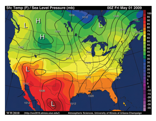
A great example of Fabrikant's work is a study that examines NOAA's familiar weather maps, which, as noted in her paper, aren't generally designed by cartographers. Take a look at the NOAA map below, which represents two key datasets: Temperature (represented by color) and sea level pressure (represented by black contours).
In this map, according to Bertin's "visual variables," temperature is more thematically important to a reader looking at the map than wind pressure, because color, its visual variable, is more visually dominant.
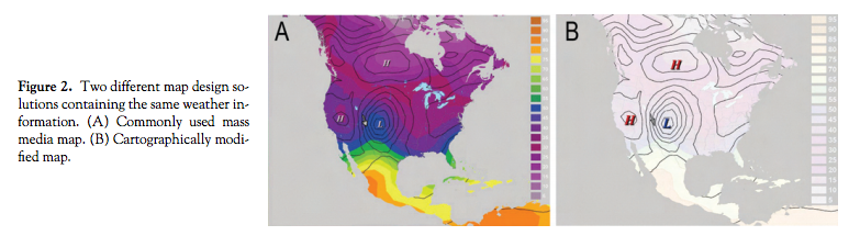
But Fabrikant wanted to test the veracity of the idea that visual dominance correlates with thematic importance. So she and her colleagues created two kinds of weather maps: One inspired by NOAA's mass-media weather maps, and one redesigned by her and her team, shown below. The maps represented the same sets of information—temperature and wind pressure—but their visual variables were different. In the mass-media maps, temperature had more thematic emphasis. In Fabrikant's maps, pressure did.
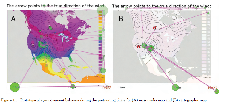
Then, the test: Thirty subjects were asked to determine whether an arrow placed on the maps indicated the correct direction of the wind (which, in this map, one would determine by studying the lines of wind pressure). The researchers used eye-tracking software to test how long subjects spent figuring out the answer, and their level of accuracy.
It turned out that the map that visually emphasized wind pressure did indeed help subjects get to the correct answer about wind direction more quickly. The amount of time they spent fixating on Fabrikant's map was significantly shorter with the cartographic map than with the mass-media map. That conclusion might sound intuitive, but now it's backed up by science.
"Are our rules really good ones?" asks Fabrikant. "If so, how? If they’re not, how can we improve them?"
Can a well-designed map help people make better decisions?
City planners and legislators make judgments using graphic displays of their regions all the time. Often, they use socioeconomic data collected through the American Community Survey—the yearly "short form" supplement to the decennial census that's distributed to about three million households—to determine neighborhoods that might benefit from improved services.
Yet the data from the American Community Survey (ACS) has a significant margin of error—about 1.25 times larger than the 10-year dataset—since it's collected from such a relatively small group.
"Especially if you want to look at a small subset of the population—say, kids under 5 who are living in poverty—the uncertainty level is just huge," says Amy Griffin, a senior lecturer in the School of Physical, Environmental, and Mathematical Sciences at Australia's University of New South Wales. "A lot of times, people are making decisions based on highly uncertain census data."
Like Fabrikant, Griffin is trained in cartography, and focuses much of her research on understanding the cognitive processes behind the use of maps. But her current research looks at not just how the brain correlates visual information with thematic relevance, but how different kinds of visualization actually affect decision-making.
For example, not all ACS data maps represent the survey's often significant margin of error, and city planners using those maps may not always have time to look back at the original data. In a survey conducted prior to the study described below, 19.6 percent of sampled urban planners admitted to "not paying much attention" to uncertainty information in the ACS. Clearly, that could have huge implications for officials trying to characterize different neighborhoods.
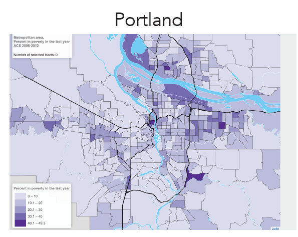
Griffin wondered how maps that visualize this crucial uncertainty information might help those planners make better-informed decisions. She and colleagues Seth E. Spielman, Nicholas T. Nagle, Jason Jurjevich, Meg Merrick, and David C. Folch tested a group of 55 urban planners from Portland, Oregon, on a task quite similar to a normal work practice: They looked at a maps of poverty in Portland, and were asked to choose the cluster of neighborhoods with the highest poverty level, which would then receive additional city services. Here's the control map, which contains no information about margin of error in the percentage of poverty in each neighborhood:
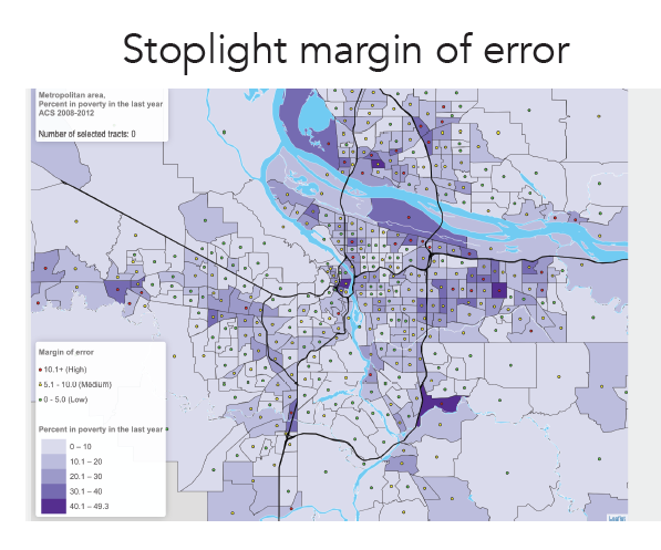
The researchers then tried presenting uncertainty information in a few different ways to see how it might affect which regions the planners chose. First, they tried the familiar "stoplight" metaphor, where uncertainty in each neighborhood was graded from low to high uncertainty:
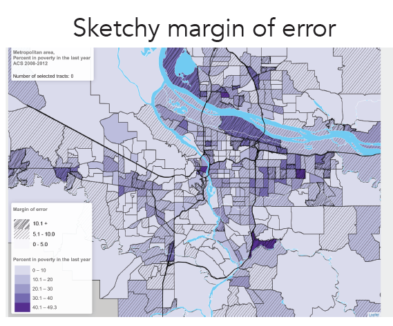
And then they tried the "sketchy" metaphor, where margin of error was represented with the density of lines, low to high:
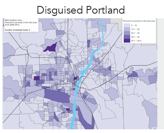
They also tested maps that represented a different measure of uncertainty, the "coefficient of variation," and, fascinatingly, maps that tested all of these variables but which showed a "disguised" Portland.
"Urban planners know their place really, really well," says Griffin. "There’s a lot tacit knowledge they draw on when they're making decisions."
To test how that bedrock city knowledge played into decision-making, Griffin and her team rotated the city, and fiddled with the boundaries of the polygons. Informationally, "disguised" Portland was identical to the real one, but it's visually quite distinct:
So how did information about uncertainty—presenting it in the first place, and presenting it through different visual metaphors—impact the planners' selection of which impoverished zones needed the most help?
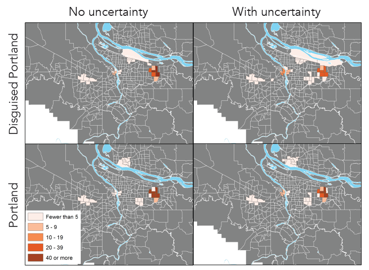
On a map of real Portland that contained no uncertainty data, most planners selected an area in east Portland, whose poverty rates are widely considered the highest in the city. With uncertainty data, however, 29 percent of participants changed their chosen regions, mostly to a neighborhood cluster downtown. And within that, the "sketchy" metaphor and the margin of error measure changed more decisions than the stoplight metaphor or the coefficient of variation.
Yet of all the combinations of variables, the map of "disguised" Portland, showing uncertainty data, had the greatest impact on decision-making. Without their long-held knowledge of their city influencing their choice, but with information about how definitively impoverished each neighborhood was, some 49 percent of participants selected a different region of the city as needing service delivery.
Whether the new decisions were better or worse isn't yet clear from Griffin's analysis. What is clear: A lack of visualized data, and a reliance on implicit knowledge, significantly impact the decisions that affect entire cities.
Once her team is wrapped up with analyzing the data from this study, Griffin would like to help create a GIS plug-in that could generates margin-of-error visuals onto a planner's map. "Every planning department uses something a little bit different in terms of what they use in software," she says. "But with web mapping, the sky's the limit."
How does my brain read a map—and how does yours?
So far, Griffin and Fabrikant say they don't think they're ready to apply neuroscience's advances in navigation to their practices. They're still invested in using cognitive and behavioral tests to grapple with how people use maps. "It’s so hard to derive inferences from [neuroscience's] methods," Griffin told me, referring to fMRI scanning or isolating special neurons. "And the methods we do use"—like eye-tracking and behavioral tests—"still have a lot of value."
But Amy Lobben, head of the Department of Geography at the University of Oregon, sees great promise in neuroscience. Unlike Fabrikant and Griffin, who research how a map's visual display affects a person's understanding of it, Lobben wants to know what neurological processes are at play as individual brains perform map-related tasks. But don't confuse her with a neuroscientist at large: She's a geographer. "I’m not interested in mapping the human brain," she says. "A brain area in itself is only interesting to me if it can tell me something about how someone is using a map. And people use maps really differently."
For example, some people process spatial information egocentrically, meaning they understand their environment as it relates to them from a given perspective. Others navigate more allocentrically, meaning they look at how other objects in the environment relate to each other, regardless of their perspective. These preferences are linked to different regions of the brain.
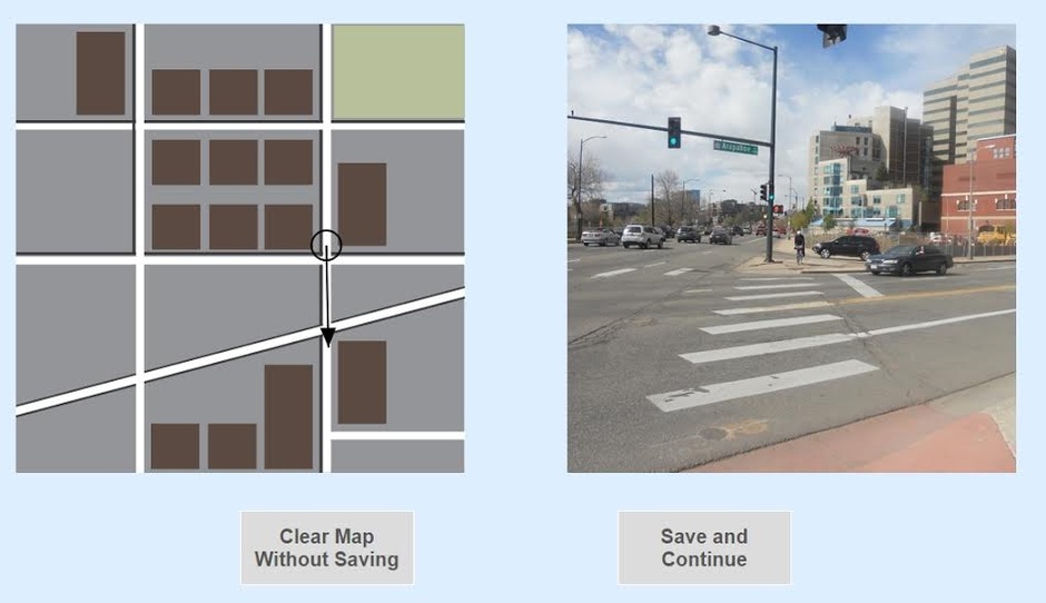
Lobben is currently studying how well people shift between these two perspectives when they're reading a map. She's shown the images below to now hundreds of subjects, asking them whether the arrow shown in a bird's-eye map (left) aligns correctly with the view seen in the street-level view map (right).
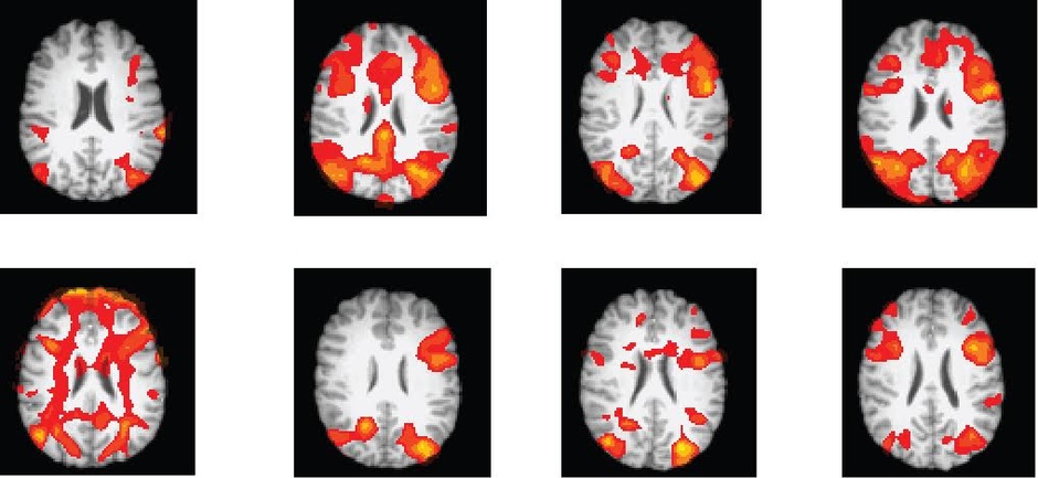
Subjects try to figure out the right answer while they're in a fMRI scanner. Lobben tracks the areas of their brain that illuminate as they grapple with the question. Below, each brain slice shows an individual's activation associated with completing the task. There's huge variation in how different brains churn through this task, and whether they're able to answer the question correctly or not.
Lobben believes that a scientific understanding of how individuals neurologically process this kind of problem could lead to personalized map-making services, and not just the kind that plot favorite restaurants or offer diverse color schemes. "People don't always know what helps them best," she says. With her testing and research, "You could potentially design a map that works with individuals' innate abilities, one that could switch to a view that person best understands."
Lobben is just about the only geographer using fMRI in her cartography research. But it's a matter of time before her techniques become more widely accepted in the geography community, alongside the more traditional cognitive and behavioral tests used by Griffin, Fabrikant, and many others.
In September, Fabrikant was one of the few geographers to attend the Vespucci Conference, a convening of neuroscientists who study navigation and spatial processing. She went hoping to link what she learned there to her cartography practice. "As much as I wished it could, I discovered this link cannot yet be made," she told me. "The science is still very much in its infancy." For now.
As a Partner and Co-Founder of Predictiv and PredictivAsia, Jon specializes in management performance and organizational effectiveness for both domestic and international clients. He is an editor and author whose works include Invisible Advantage: How Intangilbles are Driving Business Performance. Learn more...


0 comments:
Post a Comment