From the number of people who re-posted them on their own feeds, it appears that most were pleased, maybe even flattered by the result.
But there were clearly many who found it a little creepy and - we are talking about Facebook, after all - presumptuous. Is this really what I would have selected? Do I really want Facebook to make these assumptions about what matters to me and what characterizes my life? Would I prefer to be asked? And what other decisions are they making for me about what I see and hear?
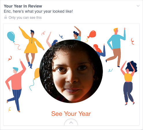
The article below is by someone, a knowledgeable, well-known and respected techie, who received one of these profiles. Tragically, the cover page featured a photo of his young daughter. Who died in 2014.
The second article he wrote, also attached below, goes on to absolve Facebook and, in act of tremendous emotional generosity, to apologize for attacking the people responsible for designing and executing the concept.
His point - and ours - is not that they are evil, or mean-spirited, or even especially thoughtless. But that there is a lot we don't know, even when we have access to tremendous amounts of data and the capacity to use them. The more we cede authority to data and technology, driven by desire to provide convenience and putative cost-savings - and because we can - the more likely we are to lose touch with the meaning of what we are doing and communicating. JL
Eric Meyer comments in his blog:
If I could fix one thing about our industry, just one thing, it would be that: to increase awareness of and consideration for the failure modes, the edge cases, the worst-case scenarios
I didn’t go looking for grief this afternoon, but it found me anyway, and I have designers and programmers to thank for it. In this case, the designers and programmers are somewhere at Facebook.
I know they’re probably pretty proud of the work that went into the “Year in Review” app they designed and developed
, and deservedly so—a lot of people have used it to share the highlights of their years. Knowing what kind of year I’d had, though, I avoided making one of my own. I kept seeing them pop up in my feed, created by others, almost all of them with the default caption, “It’s been a great year! Thanks for being a part of it.” Which was, by itself, jarring enough, the idea that any year I was part of could be described as great.
Still, they were easy enough to pass over, and I did. Until today, when I got this in my feed, exhorting me to create one of my own. “Eric, here’s what your year looked like!”
A picture of my daughter, who is dead. Who died this year.
Yes, my year looked like that. True enough. My year looked like the now-absent face of my little girl. It was still unkind to remind me so forcefully.
And I know, of course, that this is not a deliberate assault. This inadvertent algorithmic cruelty is the result of code that works in the overwhelming majority of cases, reminding people of the awesomeness of their years, showing them selfies at a party or whale spouts from sailing boats or the marina outside their vacation house.
But for those of us who lived through the death of loved ones, or spent extended time in the hospital, or were hit by divorce or losing a job or any one of a hundred crises, we might not want another look at this past year.
To show me Rebecca’s face and say “Here’s what your year looked like!” is jarring. It feels wrong, and coming from an actual person, it would be wrong. Coming from code, it’s just unfortunate. These are hard, hard problems. It isn’t easy to programmatically figure out if a picture has a ton of Likes because it’s hilarious, astounding, or heartbreaking.
Algorithms are essentially thoughtless. They model certain decision flows, but once you run them, no more thought occurs. To call a person “thoughtless” is usually considered a slight, or an outright insult; and yet, we unleash so many literally thoughtless processes on our users, on our lives, on ourselves.
Where the human aspect fell short, at least with Facebook, was in not providing a way to opt out. The Year in Review ad keeps coming up in my feed, rotating through different fun-and-fabulous backgrounds, as if celebrating a death, and there is no obvious way to stop it. Yes, there’s the drop-down that lets me hide it, but knowing that is practically insider knowledge. How many people don’t know about it? Way more than you think.
This is another aspect of designing for crisis, or maybe a better term is empathetic design. In creating this Year in Review app, there wasn’t enough thought given to cases like mine, or friends of Chloe, or anyone who had a bad year. The design is for the ideal user, the happy, upbeat, good-life user. It doesn’t take other use cases into account.
Just to pick two obvious fixes: first, don’t pre-fill a picture until you’re sure the user actually wants to see pictures from their year. And second, instead of pushing the app at people, maybe ask them if they’d like to try a preview—just a simple yes or no. If they say no, ask if they want to be asked again later, or never again. And then, of course, honor their choices.
It may not be possible to reliably pre-detect whether a person wants to see their year in review, but it’s not at all hard to ask politely—empathetically—if it’s something they want. That’s an easily-solvable problem. Had the app been designed with worst-case scenarios in mind, it probably would have been.
If I could fix one thing about our industry, just one thing, it would be that: to increase awareness of and consideration for the failure modes, the edge cases, the worst-case scenarios. And so I will try.
Well, That Escalated Quickly
So the first thing I want to say: I owe the Year in Review team in specific, and Facebook in general, an apology. No, not the other way around. I did get email from Jonathan Gheller,
productmanager of the Year in Review team at Facebook, before the story starting hitting the papers, and he was sincerely apologetic. Also determined to do better in the future. But I am very sorry that I dropped the Internet on his head for Christmas. He and his team didn’t deserve it.
(And yes, I’ve reflected quite a bit on the irony that I inadvertently made their lives more difficult by posting, after they inadvertently made mine more difficult by coding.)
Yes, their design failed to handle situations like mine, but in that, they’re hardly alone. This happens all the time, all over the web, in every imaginable context. Taking worst-case scenarios into account is something that web design does poorly, and usually not at all. I was using Facebook’s Year in Review as one example, a timely and relevant foundation to talk about a much wider issue.
The people who I envisioned myself writing for—they got what I was saying and where I was focused. The very early responses to the post were about what I expected. But then it took off, and a lot of people came into it without the context I assumed the audience would have.
What surprised and dismayed me were the…let’s call them uncharitable assumptions made about the people who worked on Year in Review. “What do you expect from a bunch of privileged early-20s hipster Silicon Valley brogrammers who’ve never known pain or even want?” seemed to be the general tenor of those responses.
No. Just no. This is not something you can blame on Those Meddling Kids and Their Mangy Stock Options.
First off, by what right do we assume that young programmers have never known hurt, fear, or pain? How many of them grew up abused, at home or school or church or all three? How many of them suffered through death, divorce, heartbreak, betrayal? Do you know what they’ve been through? No, you do not. So maybe dial back your condescension toward their lived experiences.
Second, failure to consider worst-case scenarios is not a special disease of young, inexperienced programmers. It is everywhere.
As an example, I recently re-joined ThinkUp, a service I first used when it was install-yourself-and-good-luck alpha ware, and I liked it then. I’d let it fall by the wayside, but the Good Web Bundle encouraged me to sign up for it again, so I did. It’s a fun service, and it is specifically designed to “show how well you’re using your social networks at a more human level,” to quote their site.
So I started getting reports from ThinkUp, and one of the first was to tell me about my “most popular shared link” on Twitter. It was when I posted a link to Rebecca’s obituary.
“Popular” is maybe not the best word choice there.
Admittedly, this is a small wrinkle, a little moment of content clashing with context, and maybe there isn’t a better single word than “popular” to describe “the thing you posted that had the most easily-tracked response metrics”. But the accompanying copy was upbeat, cheery, and totally didn’t work. Something like, “You must be doing something right—people loved what you had to say!”
This was exactly what Facebook did with Year in Review: found the bit of data that had the most easily-tracked response metrics. Facebook put what its code found into a Year in Review “ad”. ThinkUp put what its code found into a “most popular” box. Smaller in scale, but very similar in structure.
I’m not bringing this up to shame ThinkUp, and I hope I haven’t mischaracterized them here. If they haven’t found solutions yet, I know they’re trying. They really, really care about getting this right. In fact, whenever I’ve sent them feedback, the responses have been fantastic—really thoughtful and detailed.
My point is that ThinkUp is a product of two of the smartest and most caring people I know, Gina Trapani and Anil Dash. Neither of them comes anywhere close to fitting the Young Brogrammer stereotype; they are, if anything, its antithesis, in both form and deed. And yet, they have fallen prey to exactly the same thing that affected the Year in Review team: a failure to anticipate how a design decision that really worked in one way completely failed in another, and work to handle both cases. This is not because they are bad designers: they aren’t. This is not because they lack empathy: they don’t. This is not because they ignored their users: they didn’t. This is such a common failure that it’s almost not a failure any more. It just… is.
We need to challenge that “is”. I’ve fallen victim to it myself. We all have. We all will. It will take time, practice, and a whole lot of stumbling to figure out how to do better, but it is, I submit, vitally important that we do.


0 comments:
Post a Comment