Fake News And the Responsibility of Data Scientists
Biases are everywhere. It is the responsibility of those presenting data to be honest as well as transparent about sources and assumptions.
Anthony Carminati reports in Towards Data Science:
The same biases we see in partisan news reporting are omnipresent — existing in all places where we rely on someone (or something) to ingest facts and interpret them on behalf of others. The best representation
of facts is achieved through the delivery of information where data
scientists appeal to users while taking great care to ensure that the
data being presented does not.
95% of statistics are made up.
Discussions about fact versus truth come up quite a bit these days, especially with the proliferation of “fake news” and the news media’s coverage of certain facts (and non-facts, for that matter). We hear chatter all over the place where folks bring up hot button issues and claim “90% of people agree with my fact!”and “I have proof that X happened — it’s a fact!” Sites like snopes.com, politifact.com, and factcheck.org exist to remove political bias and interpretation from these “facts,” but why would we need such things? Is it because reporters actively make up information and deliberately lie to viewers? Or could it be that they simply tweak hard facts just enough to fit them into their preferred narrative?
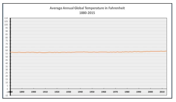
Credit: National Review
In the graph above, the National Review (via Twitter) illustrated that the average global temperature from the years 1880 to approximately 2015 showed little to no change. The important questions to ask here are:
What’s the deal with the y-axis? Why is there so much space?
What would we see if we zoom in vertically? Are there maybe some trends or cycles hidden in this (extremely) wide view of the data?
What would be considered a significant change in average annual global temperature? 50 degrees? .5 degrees?
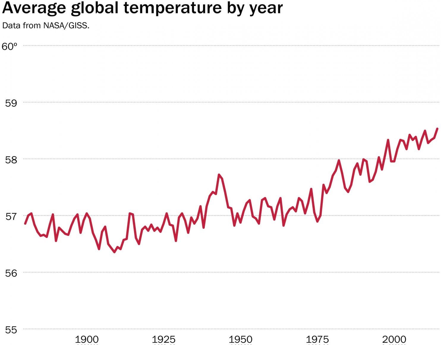
Credit: NASA
NASA published the same data, but with a tighter vertical axis. When we zoom in, it becomes apparent that since the early 1900s there has been an upward facing trend in average global temperature. Important questions to ask of this graph are:
What went on before 1900? The earth has been around for a while, after all. Could we possibly be looking at another local maximum? Should we expect this cycle to reverse naturally?
Again, what would be considered a significant increase or decrease in average temperature over time?
I know what you’re thinking, dear readers, and I promise not to dump some emotional/misinformed political manifesto disguised as a fake news piece on you, but it’s important to note in a broader context that things you hear from news commentators are not always fact and at the same time are not (necessarily) outright lies.
They’re truths — or, put a bit differently, they’re facts presented to consumers through the lens of the people reporting them. It’s true that in the context of politics this is often used to feed a partisan agenda or lead consumers to believe in one person over another, but that’s not really what I want to discuss.
Fact vs Truth, In Context
The same biases we see in partisan news reporting are omnipresent — existing in all places where we rely on someone (or something) to ingest facts and interpret them on behalf of others.
For our discussions about data science, allow me to reduce fact and truth down to data and representations of data, respectively. Taken a level deeper, data is just . . . well, data. It’s columns and rows of raw information that are usually pretty free from interpretive bias (though for any experiment, data scientists should be aware of innate human tendencies to bias data through poor design of experiments, but we’ll leave research bias alone for now).
Truth, on the other hand, is what results from the interpretation of that data. As with anywhere else in life where people are tasked with distilling raw data, what we as consumers see is a biased representation of raw fact that emphasizes whatever made the greatest impact on the interpreter(s). In other words, it is possible to have multiple valid versions of the truth, all based on the same set of facts.
The first response to this is to think “why don’t we just skip the middleman and deliver raw, unbiased facts to consumers instead of some twisted truth?” This is a fair point, but often times consumers either don’t know how or simply don’t care enough to parse through raw information; it’s time consuming, requires a great deal of subject matter knowledge expertise, and — in the context of modern applications — would severely disrupt pleasurable user experiences. Imagine having to query Netflix’s database to decide which steamy-vampire-action-thriller-zombie-slasher-horror-comedy to watch next (no thanks).
So if delivering raw facts to consumers is ineffective and delivering a more simplistic, distilled truth is subject to interpretive bias, what options are we left with? This is where the ethics and the obligation of data science experts come in.
The Responsibility of Data Scientists
It’s important to strike a balance between allowing data to speak for itself and providing a platform (soap box?) from which data’s most important features are most apparent to consumers. In practice, the criteria for what constitutes an “important feature” is highly case-specific and based off of who the user is, what the user needs to accomplish, and knowing what processes the user is capable of influencing (see: user experience research).
Stated a bit more concisely: the best representation of facts is achieved through the delivery of information where data scientists appeal to users while taking great care to ensure that the data being presented does not.
Here are a few ways to accomplish this:
Know your users: Learn their needs, technical capabilities, usability/interaction/experience preferences, and ultimately what kind of information will help them make the best decisions. Data scientists too commonly brush this step aside and get right into the data, but remember that it’s always okay to go back to basics, ask the “dumb” questions, and ensure that no unrealistic assumptions are made. It’s important.
Be transparent: Education is the data scientist’s greatest ally! Business users are becoming more sophisticated and typically don’t subscribe to the notion of the “magical black box” anymore: they want to know what’s under the hood and powering the engine. In my experience, it helps to guide users (at a high level) through the different kinds of experiments you’ve conducted, why certain models work better than others, and to highlight interesting bits of information you’ve discovered in the data — it keeps them invested in the exploratory process, and it gives them a greater appreciation for the final product.
Take care to not provide leading content (beyond the consent of consumers): Providing a call to action is okay (and in fact is often the very reason for doing data science in the first place) but it’s important to know that whatever call to action your analysis generates is not “tricking” users. For example, showing a graph with dark red indicators could lead consumers to believe that the data they’re viewing is negative or undesirable; couple this with disproportionate axes (as in our figure from the National Review) and you’ve got a recipe for a pretty misleading analysis (a word I use very loosely in this context). If you’re unsure about the implications of your visualizations, statistics, et cetera, then work with your company’s UX experts; in my experience, their role in data science is severely understated.
As a Partner and Co-Founder of Predictiv and PredictivAsia, Jon specializes in management performance and organizational effectiveness for both domestic and international clients. He is an editor and author whose works include Invisible Advantage: How Intangilbles are Driving Business Performance. Learn more...


0 comments:
Post a Comment