
But based on China, Australia and other countries that thought they had beaten the virus, it is prudent to assume that what we dont know about it still exceeds what we do. JL
Josh Marshall reports in Talking Points Memo:
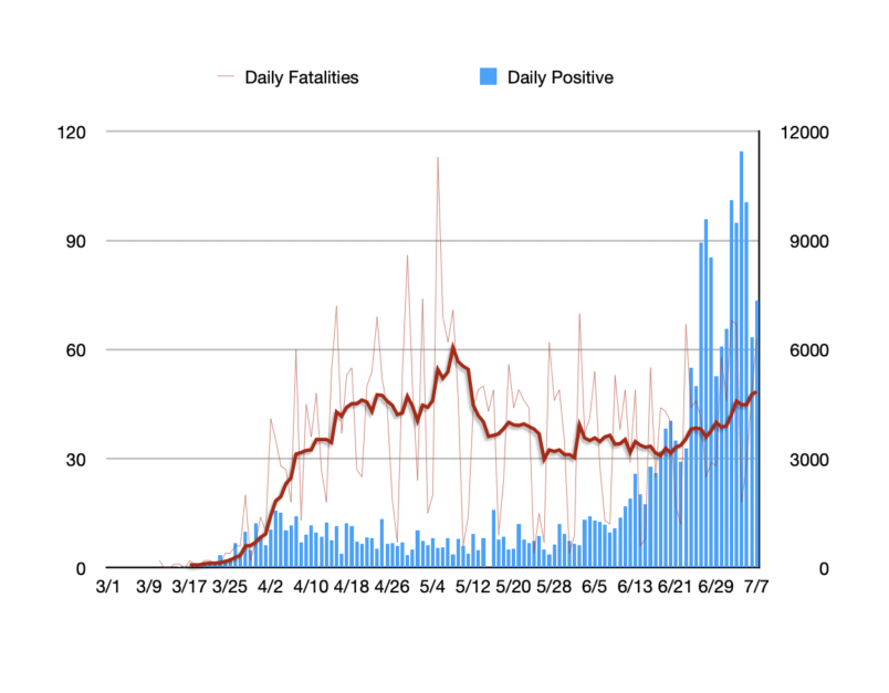
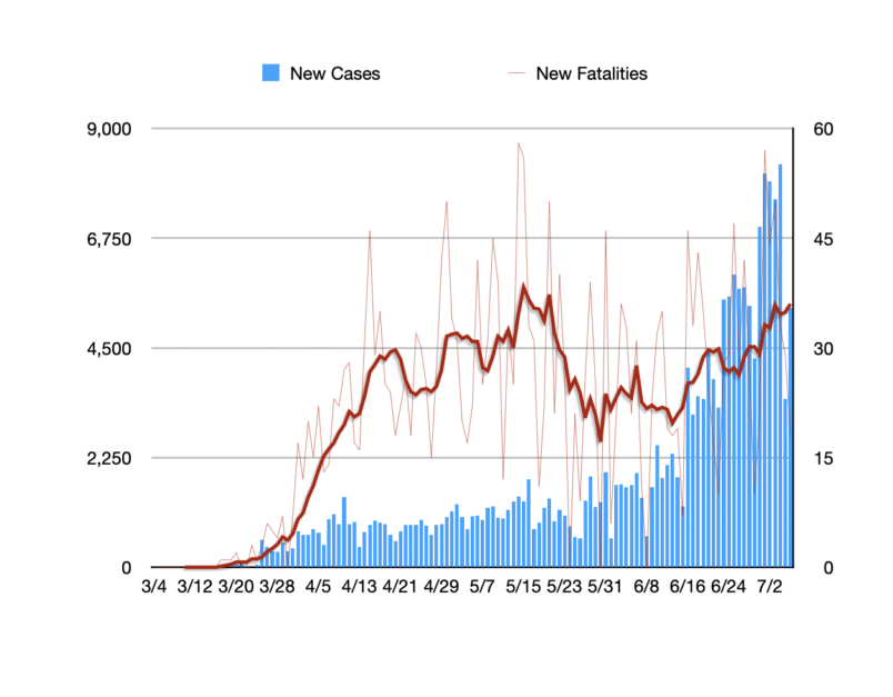
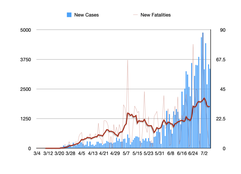
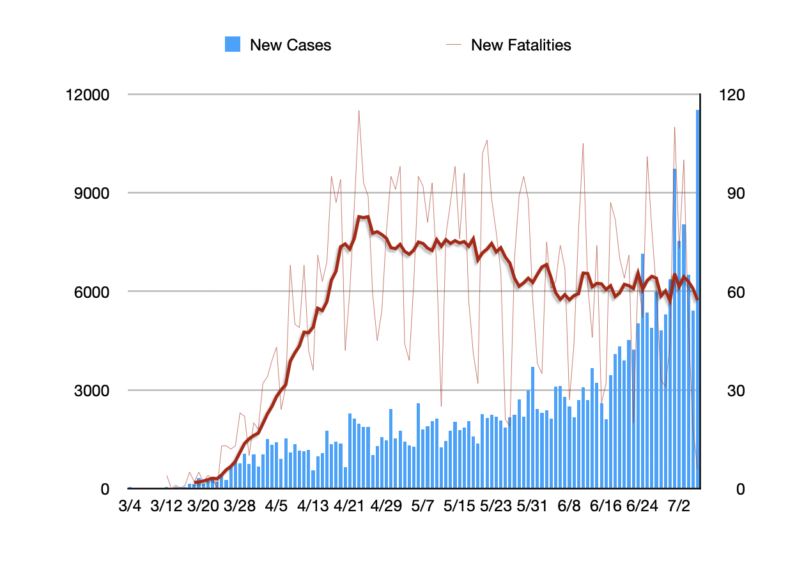
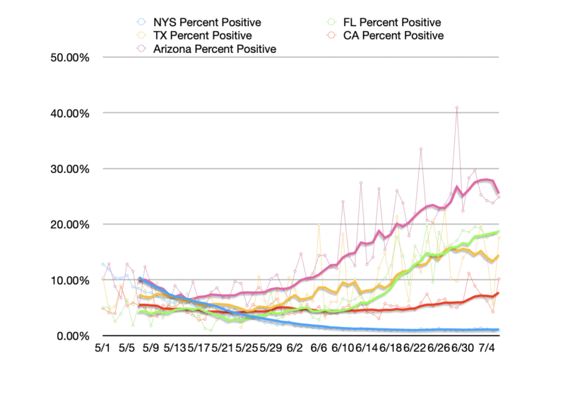
In the first half of June the average number of new cases reported across the country daily was 21,000. By the beginning of July that number had doubled though the number of fatalities has continued stable or moved slightly lower. We’re at the edge of the time interval when you would expect to see a rise in the death toll comparable to the rapid rise in cases in the second half of June. The number of deaths relative to cases remains much lower than early in the outbreak mostly because inadequate testing hid the scale of the early outbreak.One of the true mysteries of this stage of the COVID Crisis in the United States is why the death toll from the disease continues to fall, albeit slowly, even after months of plateaued cases and weeks of rapid case growth in most of the country. The White House has glommed on to this disjuncture in a highly dishonest and opportunistic way. But that doesn’t mean we shouldn’t try to understand what’s happening on its own terms.It is helpful to distinguish between two issues.The first is the range of potential reasons why fewer people may be dying of COVID or becoming severely ill even though more people are getting it – even taking into account more testing. I want to devote another post to making sense of potential reasons for this. They are a variety of factors including the age profile of people getting infected, an improved standard of care, perhaps even people becoming infected with less intensive exposure.Again, we’ll come back to those in another post.These issues apply to what we saw up to about three weeks ago. But starting in mid-June the apparent spread of the disease began to accelerate dramatically. In the first half of June the average number of new cases reported across the country daily was about 21,000. By the beginning of July that number had more than doubled.So far though the number of fatalities has continued stable or moved slightly lower.We know that people with severe COVID usually suffer with the disease for two to three weeks before succumbing. A simple look at the calendar tells us we’re right at the edge of the time interval when you would expect to see a rise in the death toll that is comparable to the rapid rise in cases in the second half of June.Still one would expect to see some rise already.To help myself make sense of this I started looking at the data in the states with some of the most rapid case growth. They provide some important context and help in understanding what’s going on. This isn’t new data. It’s what you hear reported each day if you’re listening. But these visualizations helped me understand what is happening a bit better.Here is the number of daily reported cases graphed with a seven day moving average of the daily death toll in Florida. You can see very faintly the absolute numbers plotted too. But that data is noisy so I’ve pushed that to the background for the mortality numbers and focused us on the seven day moving average.As you can see the death toll clearly is moving up and displaced by roughly three weeks from the beginning of the uptick in the case counts. We can see a similar lag in the first surge in the Spring.Here is the same graph and dataset for Texas.Here is the same graph and data set for Arizona. The drop in fatalities in recent days seems to clearly be a reporting lag. The state reported one fatality Monday and 4 on Sunday.In all three states we see a pretty similar pattern. Fatalities are following cases on a two or three week delay and the skyrocketing case counts of the last week or so will likely be mirrored later this month. What also seems clear is that limited testing early in the pandemic simply missed the scope of the early outbreak which lead to the earlier rise in deaths. That is not surprising. Testing was very limited, especially in this less hard hit states in April.The very illuminating outlier is California, another state with a rapidly rising case count.As you can see, here the number of fatalities has been pretty constant and actually declining notwithstanding the growth in the number of reported cases. The notable difference when you look at the numbers is that the positivity rate for tests in California has remained relatively constant in the mid single digits. This suggests that in California, unlike in these other outbreak states, a significant amount of the rise in cases really is due to the growth in testing.You can see the difference in this admittedly less than sightly graph. I’ve tidied up the visual by again highlighting seven day moving averages. California is red. There’s only a slight shift toward the very end in the percentage of positive tests.There are still a number of questions here about whether the demographics of the disease and the standard of care are driving lower death tolls than earlier during the crisis. For most of April, May and June outside of New York and New Jersey we saw slowly declining death tolls while case counts plateaued. That was mostly an artifact of slowing expanding testing rates buoying case counts. That all began to shift in mid-June. When we look at individual states with the big outbreaks the pattern we would expect to see is there, roughly displaced by two or three weeks from when the surge begins to show up in testing. The number of deaths relative to cases remains much lower than early in the outbreak. But that seems mostly because inadequate testing hid the scale of the early outbreak. States like Florida and Texas are reporting daily case counts roughly comparable to New York State during the worst of the crisis. But we’re not seeing mortality numbers remotely comparable and we should not expect to because those New York numbers greatly understated the true scope of the outbreak. Again, in adequate testing. The exception that proves the rule is California. And there the stable percentage of tests returning positive suggests that there the growth in cases is being driven to a significant degree by more plentiful testing.


1 comments:
The article prompts important inquiries about alterations in infection and death rates. Likewise, looking for balanced options like Affordable CIPD Assignments similarly reflects a search for obtainable solutions that are equal in quality and accuracy effectiveness.
Post a Comment