

The rebranding was a reflection of the reality its customers were already demanding with their pocket books. JL
Kristina Monllos reports in Ad Week
The coffee chain formerly known as Dunkin’ Donuts surprised consumers when it dropped ‘Donuts’ from its name, becoming simply Dunkin’. Though it’s Dunkin’s seventh redesign, it’s the first comprehensive name change since 1950. Its change garnered 3 billion impressions. Long-term food trends in “the cultural zeitgeist moved anti-carb, anti-sugar at unprecedented rates.” Adding the rebrand allowed Dunkin’ to diversify its menu. “The (previous) name limited them to a category. This allows them to grow the business.”
The coffee chain formerly known as Dunkin’ Donuts surprised consumers last September when it dropped ‘Donuts’ from its name, becoming simply Dunkin’. After introducing the change with a tongue-in-cheek campaign—proclaiming it was on a “first-name basis” with consumers—the brand rolled out new packaging this past January to reflect its shortened name. To understand what it takes for a behemoth like Dunkin’, which has over 12,800 locations worldwide, to undergo a makeover of its visual identity, restaurants, packaging, name and more, Adweek got an exclusive look inside the process.
Though it’s Dunkin’s seventh redesign, it’s the first comprehensive name change since 1950 when founder William Rosenberg made the switch from Open Kettle to Dunkin’ Donuts. The nearly 70-year-old brand worked with design firm Jones Knowles Ritchie (JKR) as well as BBDO and Arc Worldwide on the new positioning. As for the impetus: “We are overwhelmingly more coffee than we are doughnuts now,” said Dunkin’ CMO Tony Weisman.
Dunkin’ tested the name change at a couple of its next-generation stores—which are designed to have a brighter, lighter feel with nostalgic touches like bringing the bakery case forward and more modern amenities like beverage taps—and conducted consumer research in its core New England market. Weisman said “by and large it was a giant shrug,” and the soft release gave the brand confidence to execute its plan. Consumers didn’t shrug for long, as news of its name change, the most significant overhaul since 2006, garnered roughly 3 billion impressions.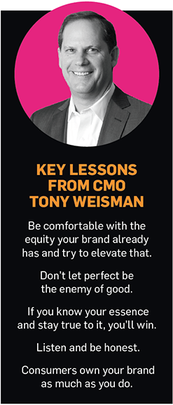
The brand’s design is a point of differentiation in a crowded market. “So many of the coffee establishments in the world are brown, serious and heavy,” said Weisman. “We thought today it was a particularly apt time to be bright, light and optimistic.”
While Dunkin’ wouldn’t share specifics about what an overhaul like this is costing the brand, it’s clear that it sees the “modernized and simplified expression of the brand,” per Drayton Martin, vp of brand stewardship at Dunkin’, as key to its future. In the fiscal year 2018 and Q4 report, where the company announced flat sales for Q4 but 0.6% growth for 2018, Dunkin’ said the investment in its makeover allowed it to become a “beverage-led, on-the-go brand.”
Courtesy of DunkinDe-emphasizing Donuts
It makes sense considering long-term food trends that the company would want to associate its brand with the beverage half of its business. Dunkin’ previously emphasized coffee over doughnuts, noted Michelle Edelman, evp, chief strategy officer at agency Peter Mayer, who pointed to Hill Holliday’s famed tagline, “America runs on Dunkin’,” which was unveiled in 2006, when Krispy Kreme was reportedly near closing.
“In the early 2000s, the cultural zeitgeist moved strongly anti-carb, anti-sugar, and consumers started to learn about healthful eating and lifestyle at unprecedented rates,” Edelman said, adding the rebrand allowed Dunkin’ to diversify its menu.
Branding consultant and Metaforce co-founder Allen Adamson compared the change to KFC. “The name limited them to a category,” Adamson said, “and this move allows them to grow the business.”
That being said, Weisman and Martin repeatedly stated that the change is not about losing doughnuts. Doughnuts remain an important part of the business for Dunkin’, and with the next-generation stores, the company is bringing the bakery case forward to showcase them. Weisman also pointed to this past Valentine’s Day, which set company records for doughnut sales.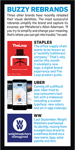
Regardless, the name change gives a “future runway for the brand,” said Tosh Hall, JKR’s global CCO.
Rethinking Dunkin’s design
Changing the packaging is key for Dunkin’ to communicate this massive shift. Currently, the company has just 130 next-generation stores with the new branding; it will take several years to remodel all of the locations. In the meantime, older and newer stores will coexist, which gave the rebranding a design structure to ensure all sites looked relatively similar. “You don’t want to feel like you’re running two different brands,” noted Weisman.
“When I arrived, the people who had been here were talking to design firms other than JKR and had landed on a modernized angle, skinnied-up font, which struck me as odd,” said Weisman. He added that if Dunkin’ had changed its typefont to something like Helvetica, “the world would be laughing at us.”
JKR’s design team combed eBay and vintage stores for Dunkin’ paraphernalia to inspire and help distill what made Dunkin’ iconic. From a design perspective, the team realized it was the Frankfurter font as well as its use of pink and orange. At the end of Q1, all Dunkin’s restaurants are using the new packaging. With each cup size, there is a different interpretation of the new logo.
“If you change it to a new font or a new fancy logo or a different iteration that has been created from nothing, it doesn’t reflect back to the heritage and history of a 70-year icon,” said Hall.
Reflecting that heritage in its cup design is crucial. “We spend a lot of money, we make a lot of ads, we buy a lot of media, but the cup is the most important asset we have because it’s the most personal,” said Weisman.


0 comments:
Post a Comment