How Well-Meaning Covid Dashboard Data Contribute To Misinformation
The public's insatiable demand for data and other information about the pandemic has fueled an explosion of charts, graphs and dashboards which update automatically and are often interactive.
While greater transparency in public policy is a long sought goal of social science, the problem is that many of the data presented are confusing, making them prone to misinterpretation. And misinterpretation can lead to the spread of misinformation, which may counteract the purpose of that transparency. The solution means sublimating speed to better quality control, explanation and quickly addressing questions or challenges. FitBit isnt the optimal design. JL
Michael Simeone and colleagues report in Slate:
We are surrounded by charts, graphs, and dashboards that summarize the pandemic. We haven’t seen this explosion of data visualization since the advent of the Weather Channel. But they offer a false sense of
transparency. Many COVID dashboards
risk confusing audiences because of their design choices and lack of explanations about the data. The majority use off-the-shelf business analytics. Visualizations adhere to conventions that confuse the
data presented (which) presents a vacuum for meaning
making. And misinformation loves a vacuum.Any gaps in explanations (are seen) as an opportunity for these dashboards to be “evidence” used
to paint
a picture of conspiracy, with the global pandemic a hoax, proof of a plot aimed at
fooling the public.
We are surrounded by charts, graphs, and dashboards that try to summarize and surveil the COVID-19 pandemic in the United States. Multicolor maps ofcases by county or ZIP code, jagged time series plots depictingcase rates and fatalities. Thin bars lined up side by side in cigarette formation to documenttests or hospital capacity. Even when the charts aren’t in front of us, we are discussing them with new household words—“spiking,” “flattening,” “hot spot.”
We haven’t seen this kind of explosion of data visualization since the advent of the Weather Channel. Millions are viewing charts published in newspapers, social media, state departments of health, all to check in on the status of the epidemic at various scales and localities. When was the last time a good portion of the country tuned in daily to a handful of charts?
But these dashboards, none of which existed before March, are experiencing some growing pains. They offer the public a false sense of transparency and surveillance in a time of intense crisis. In theWashington Post, Jacqueline Wernimont characterizes them as “vital, yet flawed,” a turn of phrase that captures exactly how much we need tools to better communicate about the pandemic. Those who make and support these dashboards deserve gratitude and recognition for their efforts, but these resources are not without meaningful flaws that we should aspire to work through. While the purpose of data dashboards is to keep audiences up to date on real-time, reliable data, many COVID dashboards risk confusing audiences because of their design choices and lack of clear explanations about the data. Based on our repeated observations over the past year, COVID-19 dashboards have not fundamentally changed in their appearance or function since their inception. Peeking under the hood at the code that runs them suggests that the vast majority of these sites have been rolled out using off-the-shelf business analytics products, or repurposed visualizations from other topics or stories. This is for good reason: Developing and maintaining a website with live data and interactive charts is intensive in time, money, and computing infrastructure resources. But this also means that these websites do not fully meet the emergent needs of people living through the COVID-19 crisis. And even in the case of journalistic venues where visualizations have been evolving to be more bespoke for the pandemic, visualizations still adhere to conventions that confuse the purpose and message of the data presented. And these collective shortcomings could backfire.
At first glance, these dashboards seem oddly familiar but foreign at the same time. Their design mimics familiar tools such as the activity counter metrics from our Fitbits, screen time reports from iPhones and iPads, and the quarterly sales reports from major companies. But what is their intended purpose? What specific problems or decisions are they supporting for viewers? Visualizing and reporting the summary figures for the COVID-19 pandemic is not as straightforward as measuring the number of steps you take in a day or number of transactions in a week. What counts as a fatality for COVID-19? Are cases counted as a positive test result or a presumed case determined by a patient’s clinical symptoms? When a daily total for new cases is posted, how do you assign a specific date to a new case? Is there a lag period? How often are these updated? What is the difference between aserology testand aPCR test? Are all of them counted together? What about patients who get two kinds of tests (nasal and saliva, for instance)—are both results counted or just one? What’s the rate of false negative results?
Every state manages testing differently, and state and local bureaucracies that span private and public health facilities and government offices further complicate the situation. So there isn’t a single set of answers that will work for every dashboard or graphic. And from Google’s own dashboards to those of states around the U.S., there are not visible, consistent explanations for how the numbers arrived to your internet browser window. Some states place explanation at the forefront, but many others bury this in fine print.
The distance between the charismatic set of visuals and the figuring that got us the numbers in the first place presents a vacuum for meaning making. And misinformation loves a vacuum for meaning making.
Seen by a friendly reader who assumes consistent empirical values and practices, these dashboards could be considered helpful information. Seen by a hostile reader who sees any gaps in explanations as an opportunity for other narratives to make sense, these dashboards can be “evidence” used to draw very different conclusions about COVID-19. And these narratives abound. Throughout unofficial channels on Facebook, YouTube, Twitter, Reddit, (formerly) Parler, and message boards, there have been sustained concerns raised about the reliability of reporting COVID-19 data.
These concerns more often than not paint a picture of government conspiracy, with the global pandemic a hoax or false flag used to secure power for nefarious actors. Seen in this way, these charts and graphs are proof of a nefarious liberal plot aimed at fooling the public, seizing political power, and robbing citizens of their liberty.
In each of these examples, data and charts are a reason for more distrust. To be fair, no dashboard or chart is going to shift a person’s worldview to suddenly transform their trust in a given institution. Those already convinced of a corrupt plot to ruin America won’t be persuaded by better documentation. But while these extreme visions of government conspiracy bolstered by bad data will not convert everyone who reads them, they do stand to sow significant doubt. And when anyone tries to validate wild claims about suspicious data by going to their state’s dashboard, they have a good chance of encountering information that isn’t well-explained or is flat-out difficult to understand.
These charts and dashboards exist in a time of simultaneous public health and information crisis. Earlier in the pandemic, one team of researchers found that more than 50 percent of social media posts about COVID-19 were likelybot and troll activity. Misinformation is a reliably consistent feature of the information streams that people encounter every day: from simple allegations that hospitals areusing COVID-19 to make more moneyto claims that the virus is part of a global plot to kill off a large portion of the population through the use of an engineered bioweapon paid for by President Barack Obama and Anthony Fauci.
What much of this misinformation has in common is that it requires people to distrust the official reports of cases, deaths, hospital beds, and more, and it is far easier to sow this distrust when there are not clear explanations for what we see. What’s more, these dashboards run on interactive web applications that are difficult to archive for outside parties, and so re-creating the reports of a given dashboard for a given day are nearly impossible—it is difficult to check any claim against the historical record of COVID reporting. If the charts look good but are not clearly explained and are not accountable to archiving, they become more available to anyone reading the pandemic as a hoax or conspiracy.
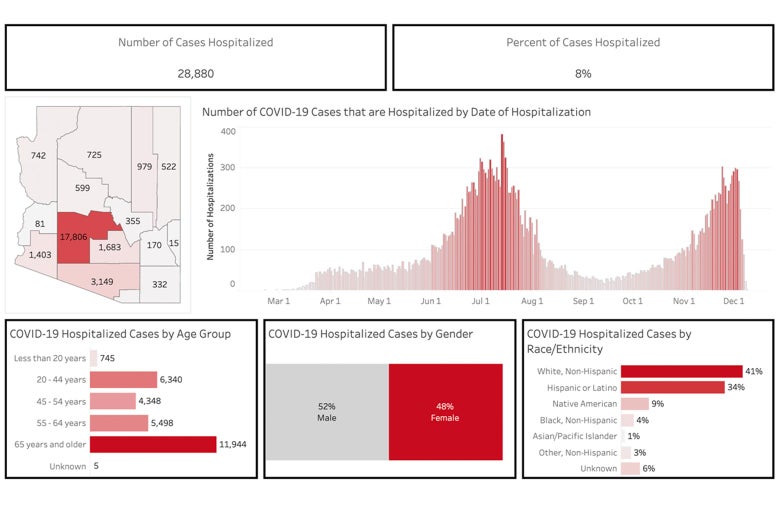
For instance, the Arizona Department of Health Services dashboard for Dec. 9—a time when cases (more than 7,000) and hospitalizations (more than 400) were climbing rapidly—showed what appears to be a falling number of hospitalizations:
The Arizona Department of Health Services dashboard on Dec. 9.Arizona Department of Health Services
The problem is that the cases are updated daily, and those daily tallies can be updated retroactively due to a lag in reporting and processing cases. This is not spelled out explicitly.
That can make it easier for observers to manipulate the information. In early July, Arizona Rep. Andy Biggstweeteda screenshot of the Arizona Department of Health Services’ COVID-19 dashboard calling on the public to not accept the media’s word and “research the data and facts” for themselves. He claimed that the screenshot showed a huge improvement in COVID-19 cases, which aligned with Biggs’ assertion that COVID-19 is an overblown hoax cooked up by the media and the Democrats.
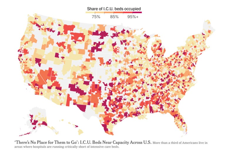
And the misinformation involving charts and dashboards need not involve conspiracy theories and overtly political narratives. Many of the charts often obscure some of the biggest challenges of the pandemic. For instance, we have seen higher death rates among minority/low-income communities and tribal nations. But the lack of reporting from these areas—itself the result of the same lack of resources that compounds the impacts of the pandemic—is too often represented in a way that makes it appear as if there is no problem at all. For instance, this chart from the front page of the New York Times, which uses color shading to indicate the capacity of ICU facilities by hospital jurisdiction, presents areas with “no data” as the lightest possible shade for the map. And while there is a labeled scale at the top of the chart, it leads one to believe that the lighter the color, the further the area is from crisis.
Northeastern Arizona, home to Navajo, Paiute, and Hopi people, is shaded in the lightest possible color. Indeed, many rural areas across the U.S. are treated similarly. But these areas have been some of the hardest hit, and presentations like this one tend to emphasize areas with more robust reporting instead. Clicking through to the full story reveals a more elaborate legend and chart.
While this version has a legend designating the lightest shade on the map as “no data,” this is not a responsible presentation. Given the conditions surrounding the pandemic and the impact of COVID-19, and the rhetorical positioning of numbers by this map wherein darker and redder means more dire, “no data” could be considered something that may visually resemble the highest values in the data, not the lowest. In other words, if the question is “where is it getting bad?,” then lack of reliable data could be an indicator for things being quite bad. Areas that lack resources, medical facilities, and support for bureaucracies that manage the pandemic will not report data as consistently, and have critical vulnerabilities that are easy to blink past in this rendition. As presented, it is far too easy to mistake that there is no COVID problem in areas for which there is no data. And the implications of color similarity between lower ICU bed usage and no data at all encodes two very different situations as being far too similar. Using very different colors for nonreporting areas would be less visually appealing, and almost certainly cost the audience more time to understand the chart, but would mitigate the risk of someone making a snap and erroneous conclusion.
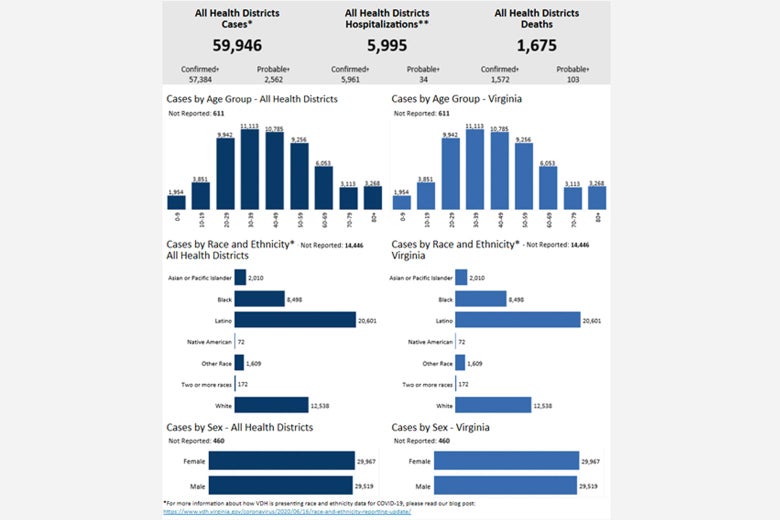
The use of bar charts to present raw data can also obscure the view of the public and decision-makers when it comes to vulnerable populations. Take this example from the Virginia Department of Health in June. It offers little sense of how the raw count of affected persons stacks up against the overall demographics of the state. You cannot evaluate any disproportionate impacts by examining these charts unless you consult additional data. But this understanding of what percentage of persons of a given race and ethnicity are affected is crucial to getting any sense of the intersectional impact of the virus. Otherwise, why report cases by ethnicity at all?
The Virginia Department of Health dashboard on Dec. 9.
And then there is the consistent reliance on maps and mapping to show the status of the pandemic. In our 50-state survey of state COVID dashboards this summer, nearly every state used a map as the central graphic for their health dashboards. Texasprovides a good example. But it is misleading to frame the COVID-19 pandemic as something where spatial proximity matters most. Namely, being close to a county that has a high infection rate does not necessarily mean that your own county is at risk. The virus spreads where people go; county-by-county choropleths (or, maps shaded by area) are insufficient to show this kind of complex interaction among roadways, airports, travelers, and their destinations. These maps offer a false sense of surveillance. North Dakota, which was the “right color” this summer and not close to any affected areas, became the epicenter of one of the worst outbreaks by the end of 2020. Shaded county-by-county COVID maps had no descriptive or predictive value for that outbreak. They show us the world without showing us the parts that matter.
While facts and clarity alone will not solve misinformation or misunderstanding, improvements to COVID dashboards should decrease conjecture, senses of false security, and ambiguity. To be clear, the burden of presenting COVID-19 data is enormous. But there is something perverse about using the same tools to show the massive losses to a historic disease as one might use for fourth-quarter sales by region. What we show and how we show it should rise to the occasion. We should make sure that dashboards offer more, not less, explanatory value than the misinforming narratives that vastly outnumber the charts and graphs published by states and newspapers. When we visualize data about a pandemic, we should think about it as presenting key relationships, risks, and changes, not reporting out a virus or body count dressed up in a variety of formats. If there’s no clear story for the data, there are plenty of available opinions out there on the internet to fill that gap.
As a Partner and Co-Founder of Predictiv and PredictivAsia, Jon specializes in management performance and organizational effectiveness for both domestic and international clients. He is an editor and author whose works include Invisible Advantage: How Intangilbles are Driving Business Performance. Learn more...


0 comments:
Post a Comment